


The KXP Photography Logo
- Kiran Parmar
- Aug 16, 2021
- 2 min read
Updated: Sep 28, 2021

So how did I come up with the logo and why I chose to go with this design and not some others that I created?
What I was looking for in my mind, would be a good fit for the type of content I would be putting out.
I wanted a bright contrasting logo to represent colour and photography. We see in colour and for my personal taste, I appreciate vibrant colourful photos with great composition and lighting.
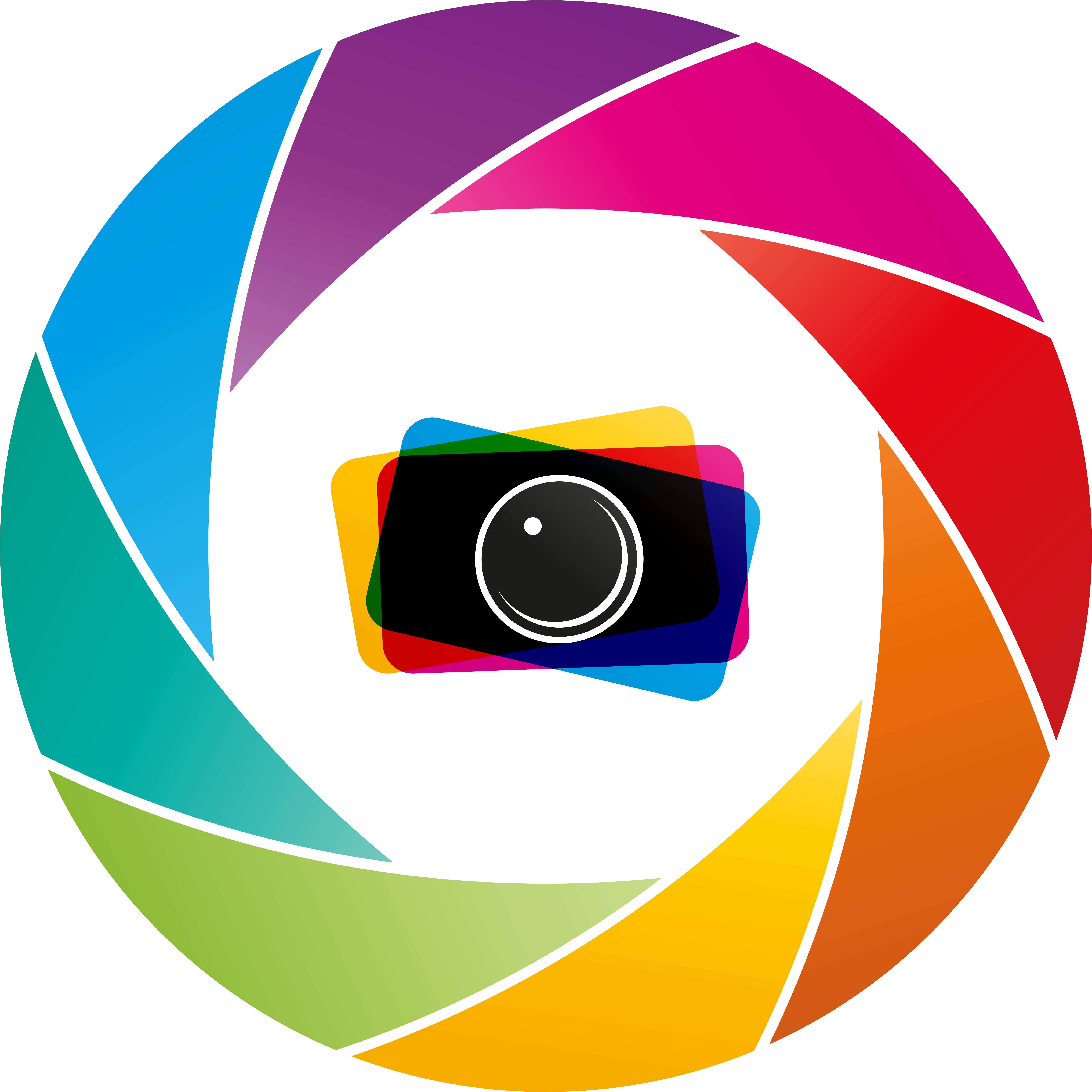
I first set out with a design of the logo to be a camera image, to represent the hobby of photography. So something like the below.

However, this logo design did not resonate too well with myself. I felt it was too much of an obvious choice of design for a photography logo. I then went back to the drawing board to generate more ideas on what I wanted the logo to be. This time, excluding the camera as a sole focus as the design, from the brief.
So here are some of the ideas I used to in the brief...
- Lens
- Eye
- Camera Components
- Colour
So the eye concept really intrigued me as we take photos from what we see. So I wanted the logo to represent an eye, yet having an element of a camera to it.
This is when I got the idea of using an aperture grill as the iris component of the eye.

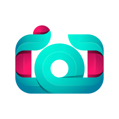
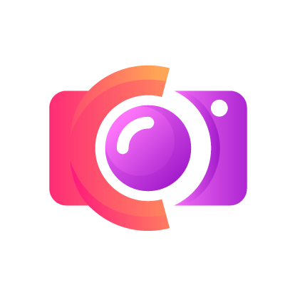
With that in mind I then needed a pupil for the eye design. Thought of using an image of a lens would do it. Examples of what I was thinking are below.


I did end up going with the top lens design.
So with the pieces coming together, and the idea of an eye represented by camera elements, the logo was coming to fruition. Now, I had to think about the colour. I wanted something vibrant and showing at least the 3 primary colours.
This is the final design for my aperture grill.

So how do I turn this into a vibrant design? Well I add colour, but how was the question. The answer came from my daughter who suggested I do the colours of the rainbow. Which I though just captured all that I had been thinking about in the first instance. I didn't have to stick to a coloured combo theme.
After a few attempts in colouring the above design, the final cut was the below.

So 1 + 1 = 2.

And now we have the eye that I envisaged.
The last piece of the puzzle was to factor in the 3 traditional primary colours of the spectrum.
Red
Yellow
Blue
The below creation came about, as it is composed of 3 basic rectangles, each representing a primary colour, stitched together with a whole cut out. Thus representing that camera I mentioned earlier.

Now we have all the pieces together we can now put the puzzle together. Which you can see on top of this article.
Why did I write this blog? Well, the logo is the image of your brand. It's your identity, where people can recognise it and know it's yours. It plays a big part in your social media presence as well as what you represent.
The logo of your brand speaks volumes to who ever you are targeting as your viewers. A good thought out logo, with intriguing thoughts makes you stand out from the crowd.
댓글